Portfolio
Project Corrections / Time spent: I edited 5 projects. The first was in the Event Ad. I cropped the picture so that the green would be part of the picture. I also had to change the symbol with the highlighted events. The second adjustment was in the web page. I added breaks in the body so that the heading “Here . . ” was with it’s information and the website description was also lowered.
The third correction was in the brochure. I adjusted the picture of the women so that her arms weren’t hitting the lines which caused an adjustment of the four repeating blocks. The most changes dealt with the letterhead and business cards. I added some improvements with getting rid of the black squares and changing the fonts and placement of the name. The last change was in the Logos project with changing the beginning letters of the logo to the same font as the “S” on the cupcake. I also needed to change the skew to 17% and raised the “S” on the cupcake.
I spent 2 1/2 hours on the corrections.
Message: An opportunity to show the progress and knowledge that I have learned this semester.
Audience: Potential clients and fellow students
Top Thing Learned: The importance to check and recheck work including color matching, alignment, and cohesiveness in a final product.
Future application of Visual Media: This class has been great in heightening my awareness of the visual media that I see everyday. I notice typeface and alignment of other media constantly now. I look forward to being able to apply this information to future projects.
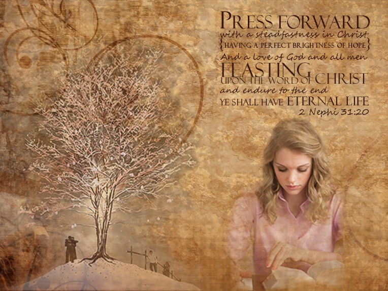
Color scheme and color names: Analogous; gold #716558 ; lime #a4ba39; yellow
Title Font Name & Category: Verdana, san serif
Copy Font Name & Category: Baskerville Old Face, oldsytle
Thumbnails of Images used:

Sources (Links to images on original websites / with title of site):
http://all-free-download.com/free-vector/download/classical_pattern_background_04_vector_151333.html


 Light 1: Outside
 Light 2: Inside
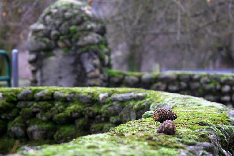 Focus 1: Foreground
 Focus 2: Background
 Composition 1: Thirds
 Composition 2: Lead Room
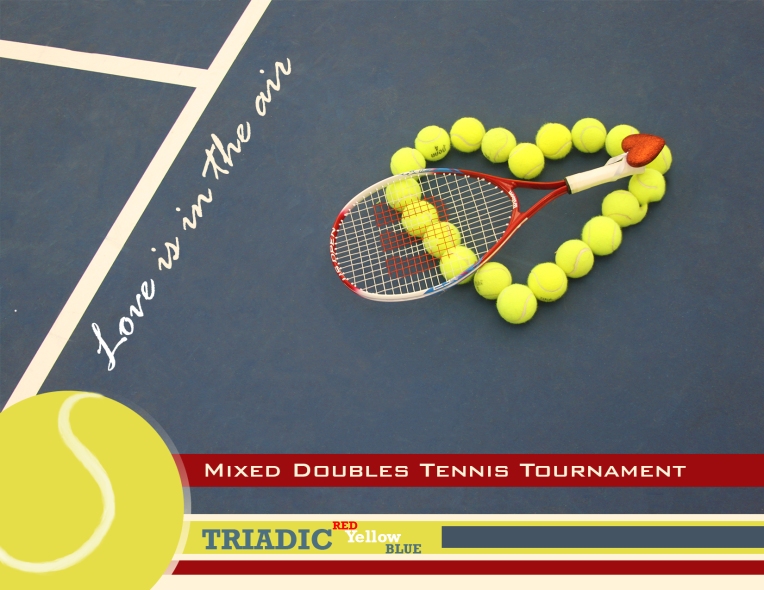
 Description: Event Ad project